 Oct 29, 2025
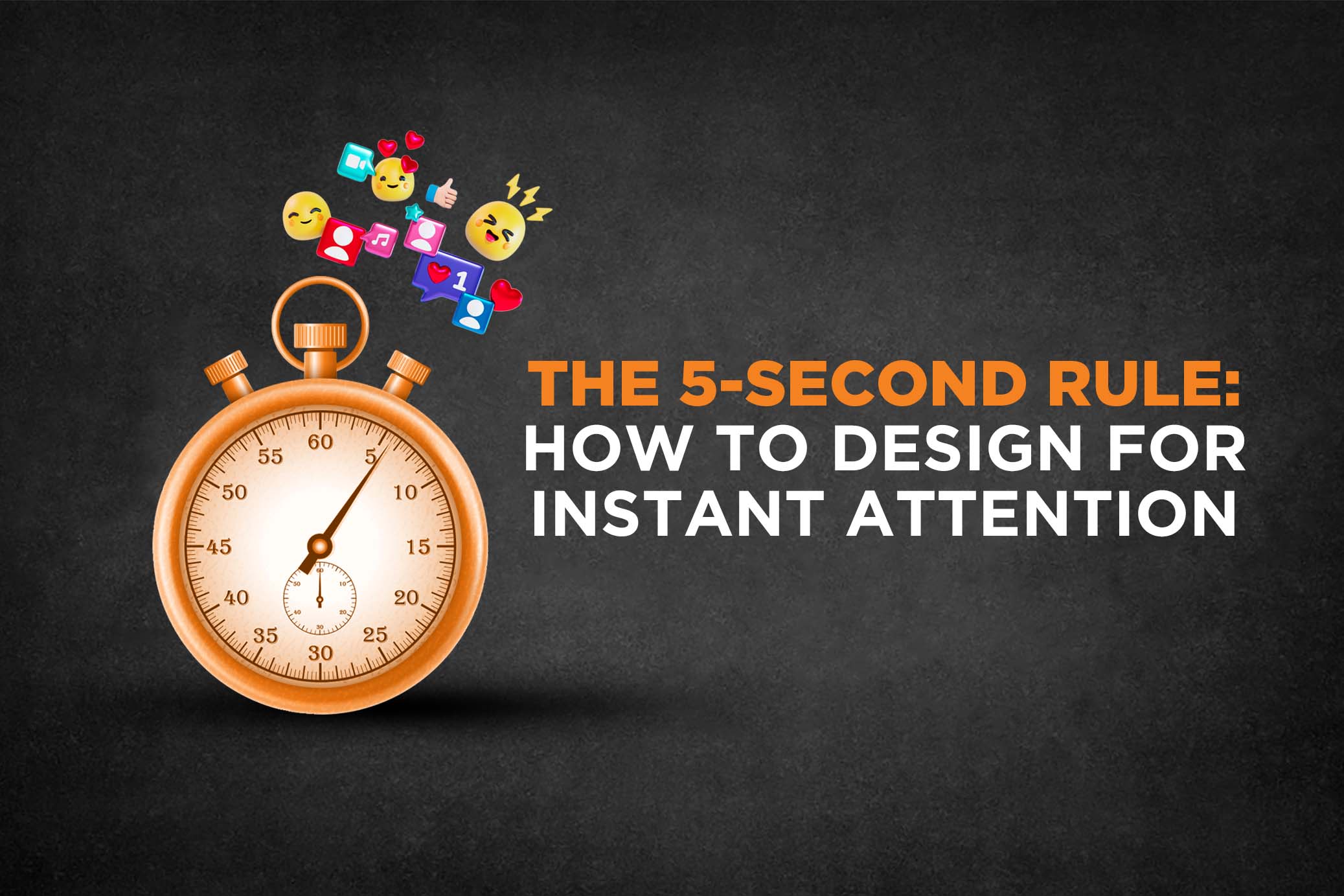
The 5-Second Rule: How to Design for Instant Attention
In the fast-paced digital world, you have just 5 seconds (or less) to capture your audience’s attention. Whether it’s a website, ad, social media post, or landing page, where users decide almost instantly if they'll engage or bounce.
This is the 5-Second Rule in design. And it can make or break your creative impact.
What is the 5-Second Rule in Design?
The 5-second rule states that within the first five seconds of seeing your content, a user should be able to clearly answer three essential questions: What is this about? Is it relevant to me? And what should I do next? If your design doesn't answer these questions quickly and clearly, chances are the user will scroll past or exit regardless of how good your message, product, or offer may be.
Why Does Attention Span Matter in Design?
Several studies, including one by Microsoft, have shown that the average online attention span has dropped to about 8 seconds and that includes time spent waiting for content to load or fighting digital distractions. That leaves just a small window for your visuals, headline, messaging, and call-to-action to do the heavy lifting. Within those initial 5 seconds, you must communicate your value clearly or risk being forgotten.
If you're struggling with scroll-stopping messages, check out our blog: 6 Biggest Challenge in Social Media Marketing
How to Design for Instant Attention: 5 Proven Tips
Lead with a Bold Visual Hierarchy
Users typically scan content in a Z or F pattern. To grab attention instantly, make sure your most critical elements such as your main headline, subhead, hero image, and CTA are placed where the eye naturally goes first. A strong visual hierarchy helps direct attention exactly where you want it and prevents confusion or disinterest. If a user glances and can't immediately find the core message, they won’t stick around to search for it.
Use Contrast to Guide the Eye
Design is not just about looking good, it’s about guiding focus. High contrast in color, typography, and spacing helps key elements pop, allowing the brain to process them faster. Think about bold CTA buttons that stand out, font weights that create hierarchy, and background separation that enhances readability. Contrast isn't about being loud, it's about being clear.
Design Mobile-First, Always
With most users consuming content on mobile, designing for desktop first is no longer the standard. Your headlines need to be shorter (ideally under 8 words), CTAs need to be visible without scrolling, and visuals need to be optimized for smaller screens. When you design mobile-first, you’re forced to prioritize clarity and function which directly supports the 5 second principle.
Use One Focus Per Frame (Especially for Reels & Ads)
Short-form video content is judged in milliseconds. If your first frame doesn’t hook the viewer, it gets skipped. Keep each frame focused on one core idea supported with large, clear on-screen text that sums up the message in just a few words. Something like “Branding Tip You Need” or “Before & After Reveal” communicates instantly. For a deeper dive into tools that can help enhance your short-form content, check out our blog: Top Free Video Editing Tools for Reels, Shorts & Ads in 2025, which also links back to Video Marketing: The Modern-Day Killer Strategy and AI in Graphic Design for a broader view on tech-powered creativity.
Design With CTA Clarity
Your call-to-action should be loud and clear but also purposeful. Users shouldn’t have to guess what happens next. Whether it's downloading a guide, filling out a form, or watching a video, spell it out. Instead of vague buttons like “Click Here,” go for specific actions like “Get Your Free Quote” or “Watch Full Reel.” The more confidence you build in that micro-moment, the more conversions you’ll gain.
Bonus Tip: Test Your Design — Literally
Before you launch any design, try a simple 5-second test. Show your layout to a few people for just five seconds and ask them what they think it was about, what they noticed first, and what action they were supposed to take. If their answers are vague or off-target, your design may need refining. Often, simplifying your layout brings more clarity than adding more elements.
Final Thoughts: First Impressions Aren’t Just Visual — They’re Strategic
The 5-second rule is more than a design principle — it’s a mindset. It pushes creators, brands, and marketers to think from the user’s point of view and deliver messages with surgical clarity. In a world overflowing with visual content, the ones that win are not the loudest, but the clearest. Whether you're crafting ads, reels, or landing pages — if you master the 5-second rule, you master the scroll.
-
Latest posts
-